as examples of the best design of their era.
The First Volume—1845
This was a large format newspaper (15" x 20") of four pages; i.e. a single sheet folded. There were initially 8 weekly issues published by Rufus Porter on Thursdays from 28 Aug 1845 to 16 Oct 1845. These have all been transcribed by the Electronic Historical Publications (link broken) web site run by the University of Rochester, NY, USA. Then there was a three week hiatus when, I have heard, the business was sold, but weekly issues continued from 13 Nov and the new owners, Munn & Co, did not appear on the cover until issue 44. It remained in this format until issue 52 on 17 Sep 1846 with only one week missed.

Masthead for volume 1.
The Weekly Tabloid—1846–1858
It was relaunched on Saturdays starting 26 Sep 1846 in a smaller format (11" x 16") and eight pages per issue, still edited by Rufus Porter until number 36. Volume II issues 1 and 12 are both on the above web site (note that they have the year wrong). Volumes II to XIV, 52 issues per year, spanning from 1846 to 1858, are all on the Making of America website run by Cornell University, NY, USA both in image and plain text. This is a wonderful resource.

Masthead for volumes II–IV.
Volume V (22 Sep 1849) saw the introduction of a slightly different masthead and a decorated border. With small changes to the border corners this remained until the end of volume 8.

Masthead for volumes V–VIII.
From volume IX (17 Sep 1853), a small alteration to the style of the capital “S” saw it through to volume XII, again with various corner ornaments.

Masthead for volumes IX–XII.
The final years of the old series, volume XIII (12 Sep 1857) and XIV, saw a much more ornate masthead.

Masthead for volumes XIII–XIV.
At least from volume VI (21 Sep 1850) the bound editions had an overall volume title page. If this was done in the usual way for serial published works of the time, it was the final issue for the volume that came with a suplement of an index and the title pages as a bonus for faithfully keeping up with the subscription. Then it was possible for it to be bound as a large format book in any style desired by the owner.
The first first known volume cover design, which was used for volumes VI and VII only, was very plain, almost C20th in style but made up from stock type and decorative blocks.
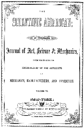
Title Page for volumes VI–VII.
For the remaining volumes of the first series, volumes VIII (18 Sep 1852) to XIV, it was a very grand ornate design with a classical theme. This was early work done by the noted engraver and flamboyant publisher Frank Leslie. Born Henry Carter on 29 Mar 1821 in Ipswich, Suffolk, he became head engraver for the Illustrated London News at 22. He emigrated to New York in 1848 and worked for P. T. Barnum until he founded his own illustrated magazines in 1854.
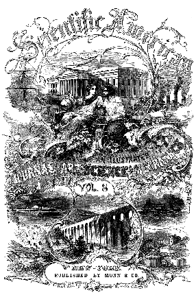
Title Page for volumes VIII–XI (Frank Leslie, Heinicke &
Parsons, signatures removed on vXI.)
Later, as the plate was becoming worn, it was re-engraved for volumes XII (13 Sep 1856) to XIV with a bolder solid heading.
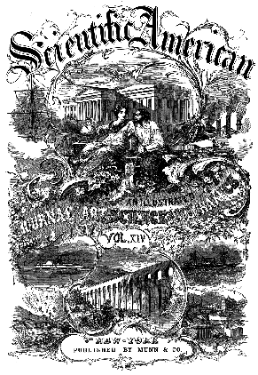
Title Page for volumes XII–XIV (Frank Leslie, Heinicke
& Parsons, uncredited.)
The New Series—1858–1896+
June 1859 saw the end of the old series with only 42 editions published in the final volume. This was to give way to a new series with 16 pages per issue. It was still published weekly from 2 Jul 1859, but with two volumes per year, presumably to retain the possibility of binding.
Volumes 1 to 21, 26 issues each, spanning from 1859 to 1869, are all on the Making of America website run by Cornell University, NY, USA both in image and plain text.

Masthead for new series volumes 1–15.
The volume title page was a new design by Arthur Lumley. Born in Dublin in 1837, he was an up and coming artist who became a civil war correspondant for Leslie’s Illustrated and later worked for Harper’s Weekly.
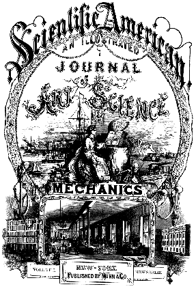
Title Page for new series volumes 1–15 (H. Teneyck &
A. Lumley.)
From new series volume 16 (5 Jan 1867) a new mast head was introduced which lasted until volume 85 (1901). For some reason, the volume title page reverted to the Frank Leslie design of 1852 in its first state but without the aparent plate wear so perhaps it was faithfully copied. Certainly the signatures were removed. However the supplements that were introduced had a different cover and later ones, bound into the main volumes, had a diferent masthead.
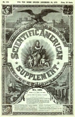
Early Supplement Title Page for new series

Masthead for new series volumes 16–74+.

Later Masthead for new series supplements.
There were subtle changes to the masthead from volume 86 (1902) but the biggest change was pictorial covers for special issues, some in full colour and a few of which are show below. The first of these was the first Automobile issue on 13 May 1899 and they became more frequent at the turn of the century. Some, such as the 1908 issue, show remarkably modern design techniques

Masthead from new series volume 86.


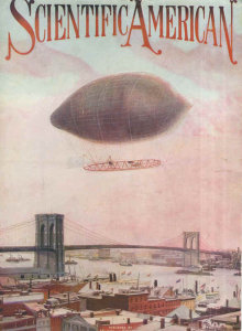


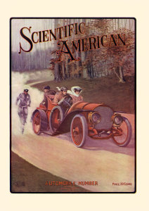

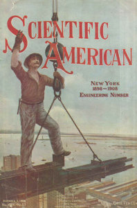
Special Issues 1902 (1 Mar), 1904 (17 Dec), 1905 (16 Dec), 1906 (13 Jan), 1906 (3 Mar), 1907 (9 Nov), 1907 (7 Dec), 1908 (5 Dec) Most of these from magazineart.org with thanks. Hans Haverman has collated 21 special covers with fine scanned images of copies from this period in very good condition.
In 1911 a new simpler style was introduced with colour pictoral covers for many issues.
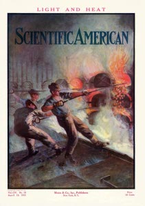

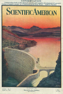
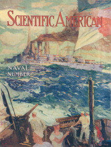
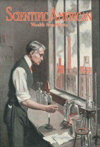
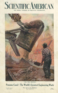
Issues 1911 (Apr 15), 1911 (Jun 17), 1911 (Aug 12), 1911 (Dec 9), 1912 (Jun 15), 1912 (Nov 9) Two of these from magazineart.org with thanks.
Then, in 1913, came a little backward step introducing a border which was to last until the end of first world war hostilities.

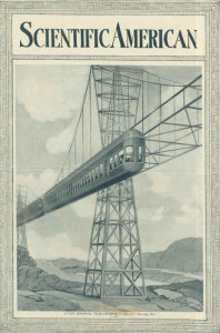
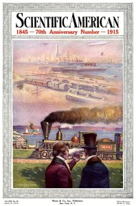
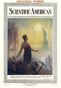
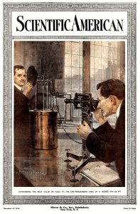
Issues 1914 (7 Nov), 1915 (27 Mar), 1915 (5 Jun), 1916 (4 Mar), 1916 (18 Nov) Most of these from magazineart.org with thanks.
At the end of the war, in 1919, the design was changed to a cleaner look with a simpler border but mostly using one or two colour and black, a style I distinctly remember for the inside illustrations when I started reading them in the 1960s. The page size was also reduced to Quarto (11½" x 8½")
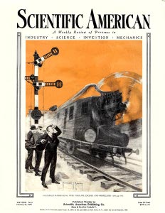
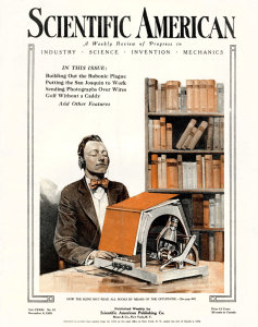
1920 Issues (21 Feb and 6 Nov) both from magazineart.org with thanks.
There are some covers for the period from 1900 to 1921 on the Nostalgiaville site and a lot more on Magazine Art which show that the period was unsettled with many different designs, some very modern looking, changing sometimes even during the course of a year.
The Modern Magazine
From Novemeber 1921 the format changed to a modern monthly magazine, with a full colour cover. Howard Vachel Brown, who was one of the artists from 1913 was now responsible for the majority of the cover paintings until he left in 1931.
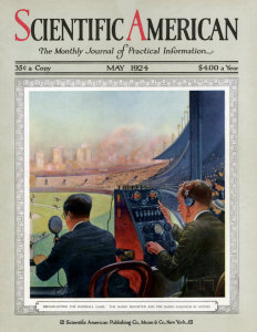
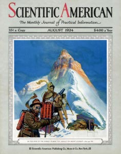
Covers May and Aug 1924 both from magazineart.org with thanks.
By 1928 we see a style that will be very familiar to modern readers with a lot of white border, a very simple masthead and a full colour painting (mostly by Howard V. Brown).

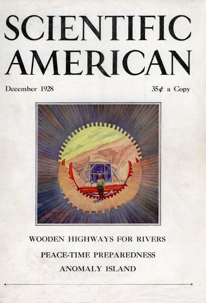
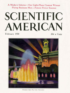
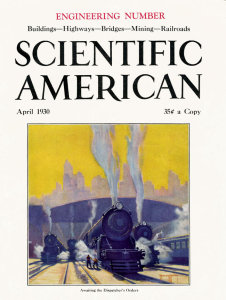
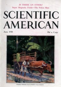
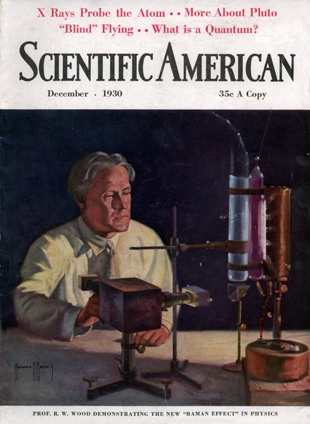
Covers Nov & Dec 1928 and Feb, Apr, Jun and Dec 1930.
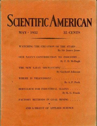
But by 1932 this had reverted to a very dull cover. Full colour was still available (see the advertisement on the back) but a plain orange with typeset captions was used for the front looking very much like a learned journal. Perhaps this reflected the depression era or just the leaving of the resident artist. The inside pages were still black and white.
And by 1938 the picture (now a photograph) had reappeared but in black and white.
By the time I started collecting them in the 1960s and some back numbers I managed to obtain, the format had settled to the familiar white-background magazine format (introduced in November 1952) with a full colour photograph or painting. There were a number of artists involved, but somehow there was a common style—simple design, colourful and made to get you to look inside to see what it was all about. The artists skill in illustrating some of the most abstract concepts was remarkable.
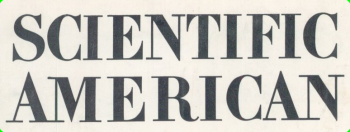
Masthead from the late 1940s—March 2001 (with variations). Hans Havermann, mentioned earlier, has a fine collection of covers online from May 1948 though to August 1987 complete.
See some scans of the covers from my collection from the 1950's to nearly the present day in the online Gallery.


 Webmaster